
How to Use This Blog
Yes, it might improve your ROI.

I wrote a post like this in the past, but wasn’t as detailed as I should have been how to use this blog to improve investment returns. Part of that is due to the evolution of the blog since.
This blog provides both strategic and tactical signals of sustainability in stock price trends as related to states of disequilibrium in the US economy. States of disequilibrium are caused by unstable monetary policy and follow a familiar pattern in regimes in which central banks target inflation, as does the Fed. Flat inflation rate targeting is pro-cyclical and wages are sticky, so such an inflation target can allow NGDP growth to stray from the long-run trend, over- or under-stimulating the economy and hence causing much instability in stock prices. Sticky wages help cause sticky core prices, as in the Fed’s preferred core PCE inflation metric, such that changes in this metric lag changes in real output.
The strategic signal comes from the expected NGDP growth rate output gap, which is revealed in the spread between the S&P 500 earnings yield, using same quarter earnings, and the NGDP growth rate. This can employ reported, backward-looking data or forecasted earnings, stock price futures, and related NGDP forecasts for forward-looking signals.
This output gap is a good indicator, because there is an equilibrium relationship between the S&P 500 earnings yield and the NGDP growth rate. This reflects the classical economic principle that the rate of return on capital should equal the economic growth rate, in equilibrium. In fact, since 1948, the mean difference between these two metrics is only 0.24%, and is similarly low over many shorter stretches. (Data from Shiller and FRED)
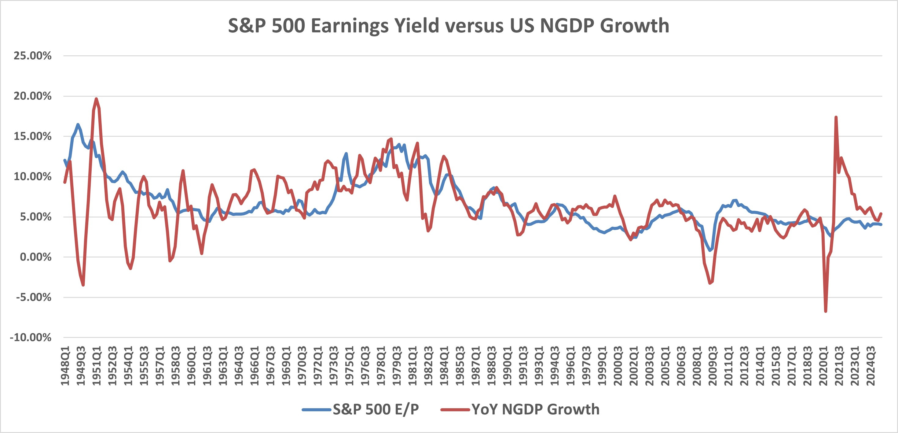
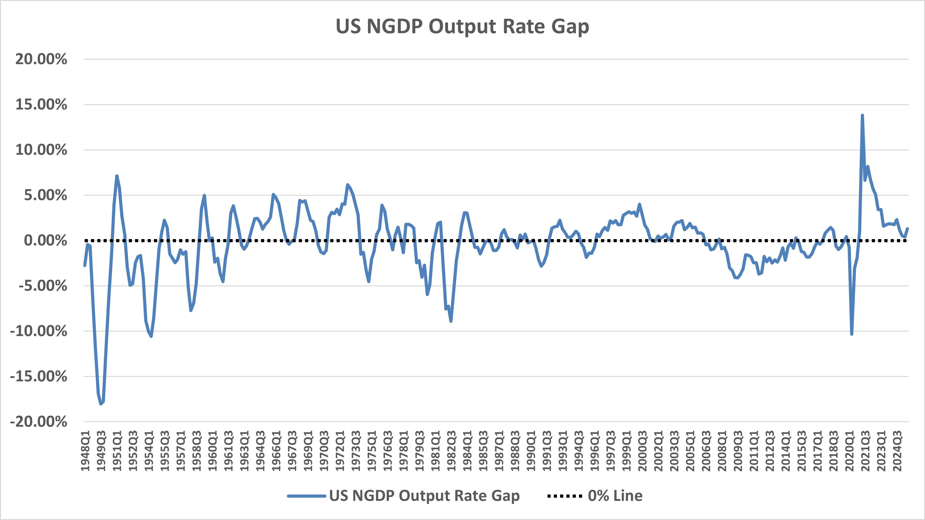
Looking at the bottom chart, that for the US NGDP Output Rate Gap, you can see that periods of hyper- or hypo-stimulation last roughly 4-to-5 years at most. This provides a pretty good estimate of how long such periods can last before wage adjustments cause changes in inflation to which the Fed responds to defend its inflation target. Note the period of hyper-stimulation during the dot-com boom and hypo-stimulation during the Great Recession and slow recovery, along with the extremes reached during the pandemic and its recovery. This metric provides a good guide for whether a “bubble” in stock prices exists and how long it can last.
Of course, the Fed can change its policy short of full wage and price adjustment cycles, and hence a tactical indicator is also useful. The best one I’ve found in recent years is the 5-Year/5-Year forward inflation expectation rate. It reveals market expectations for the average inflation rate for the the second 5-years of the next 10, ignoring the most immediate 5 years which can reflect temporary inflation changes due to supply shocks. It is based on TIPS spreads, which is the difference in yields between inflation protected and non-inflation protected Treasury bonds. Expect Fed action in some short time frame after this measure rises to or above about 2.35%, which is 2% in the Fed’s preferred core PCE terms.
These guides can obviously help investors avoid or hedge against the most extreme volatillity in stock prices, increasing profits.
For more information about the metrics used here, see the blog’s User Guide.
Note: This post, as is the case with all my posts, should not be construed as offering investment advice. Such advice should be tailored to the individual investor by qualified professionals who, ideally, are fiduciaries.